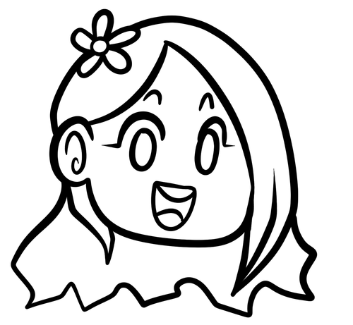
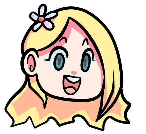
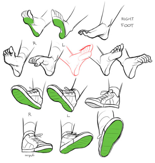
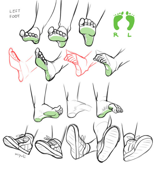
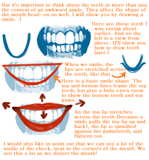
Yep… So This Is What I Think Might Be Helpful. Check This Tutorial By Sinix [x] It’s Super Helpful
![Yep… So This Is What I Think Might Be Helpful. Check This Tutorial By Sinix [x] It’s Super Helpful](https://64.media.tumblr.com/41f1b7decc5b76e5eb4d359f1da5f2b6/tumblr_p4daqxcgoF1u5z07fo1_500.png)
![Yep… So This Is What I Think Might Be Helpful. Check This Tutorial By Sinix [x] It’s Super Helpful](https://64.media.tumblr.com/e917ce74c3b35ab72183547c62e3183a/tumblr_p4daqxcgoF1u5z07fo2_500.png)
Yep… So this is what I think might be helpful. Check this tutorial by Sinix [x] it’s super helpful for drawing faces from different angles. Generally, if I can imagine a head in 3D I’m able to draw it and drawing eyes first helps me visualise everything. (It’s super sketchy but hope it’s understandable anyway :))
More Posts from Artrefforsteph and Others
Watercolor Tutorial
As promised a step by step guide, which hopefully will help you understand how I work with watercolors. If you have more questions I’m glad answer them.

Materials: Pencil (2H), Daler Rowney Fine Grain - Heavy weight paper (A5, 200g/m2), Windsor & Newton watercolors, Ink and drawing pen, colored pencils, white paper, tissue

Keep reading
Just a quick tip to artists

If you’re an artist who likes to work really close, (like me), do yourself a favor and put up two views. You can do this by clicking View–> New on your toolbar.
There’s nothing worse than finally zooming out and realizing what you were doing was very wrong. This saved me a lot of grief tbh. I’m sure everyone knows this already but ._.;; I arrived quite late to that party.
HIIRAREFS: Basic and Intermidiate guide to colouring in
What better day to end the year then with a basic guide to colouring- This is for beginners or intermediate artists. Colouring is a big part to an art piece, whether you decide to use colours or not, that’s up to you, but for the most part, having some knowledge on appliance of colour will really help you out!
____________________________________________
ARTISTS WITH AN INSPIRING KNOWLEDGE OF COLOUR APPLICATION! Please take the time to have a look at other artists work so that you ca research and get inspired!
Gullacass: Uses brights, dulls and pastels to create brilliant guro, pop and macabre pieces| DA + TUMBLR
TinyCalcium: Old friend of mine who explores brights and mustard colours and places them as a foundation for their work | TUMBLR
BeastPop: Talented with opposing and Triwheel colours. Outstanding cell-shading, and knows how to flexibly bend colour form to their will in popart. | DA
H0stel: Fantastic composition of light direction and applies colour to bodies based on ambient occlusion. | TUMBLR
_____________________________________________
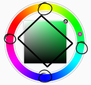
COLOUR SLANG: I use some strange slang to express colour types and shades as well as groups. Although they may not be canonically correct, I will use these terms to describe colour palates to the best of my ability! Analogous: Colours that are near or adjacent to each other on the colour wheel, EG: Red and Orange
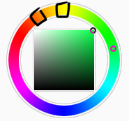
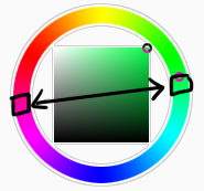
Oppositional/complimentary: Colours that are opposed or opposite from each other on the colour wheel, EG: Cherry and Green
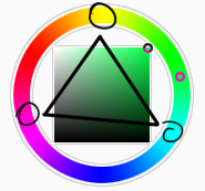
Triadic: Colours that form a triangle on the Colour wheel, EG: Cyan, Magenta and Yellow. These three colours when mixed together will make black.
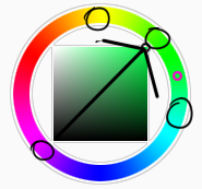
Arrowtype/Quadcolour: Four colours, that generally form an arrow shape on the colour wheel.
Tetradic: Colours that form a rectangle or square in the colour wheel
Neons: The very brightest you can get a colour, be careful where you use them as they can look ugly together at the most. Try to use neons when you are adding bright glowing objects to your piece. Neons are great for highlights.

Brights: Slightly washed Neons. Appropriate if you have characters that are colourful.

Washed: Very washed brights with a hint of grey. These are also useful for colourful characters.

Pastels: Colour with white in them to make them seem light.
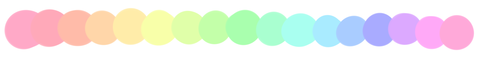
Baby Pastel: Pastel with even more white in them, good for subtle highlights.

Darks: Colour with black added to them. Used mostly for lineart.

Mustards: Colours with dark grey added to them

Earthen: Colours with brown added to them

Warm and Cool colours: Warm colours are colours that range fromMagenta to Yellow. Cool ones range from Lime to Fuchsia.

Straight tones: A greyscale palate. or a straight scale of one colour from black to it’s neon form.

Warm and cool tones: Warm tones are a greyscale mixed with warm colours and cool tones are greyscale mixed with cool colours.

Skintones: Warm washed or pastel colours generally used to colour in skin, but they don’t have to be warm at all! ( I will not show you a palate for this however)
______________________________________________
WHAT TO AVOID WHEN COLOURING: beginner artists, tend to go ahead and start by colouring their line art with neon and mustard colours. Neons are not necessarily good for base colours unless the character has a glow.
I often see lazy attempts to shade, often a beginner artist with use an airbrush and use black and white to shade and highlight their piece. This is not very effective, and I’m sorry to say… It’s kind of gross as well. Try to avoid being lazy. If you have a piece that has bold black lines, avoid using soft shading and airbrushing at this point of time.
Black and white isn’t always the best option when colouring in your piece, but it also depends on the style you are trying to convey. If you plan on only using straight tones to colour in a piece, black and white is good.

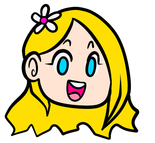
A GOOD BASIC WAY TO COLOUR For this basic tutorial I will show you a nice way to colour in a piece with bold lines. I will be using Minty’s Classic character as an example.
Begin with using brights that have been washed down a little and washed skin tones if your character is human based. Avoid using neons or mustards if you are able. If there is white on the character, such as the white on an eyeball or the teeth, consider using baby pastels. For Minty’s eyeballs I have used a baby pastel blue. I have chosen to use a darker and more washed version for her Irises.

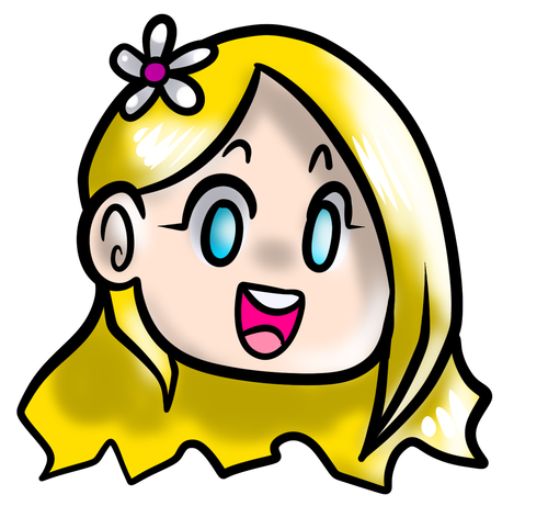
With you foundation colours placed down, use a washed warm colour for the skin tone, such as a salmon. If the character’s hair or fur is warm coloured, use a pink or red orange to shade that as well. Use the cell shading technique. This may mean you will have to erase some of your shading so be sure to do this on another layer. For your baby pastels, you can use a regular pastel to shade it. For Minty’s eyes I have used pastel blue and lowered the opacity by a little.
For Highlights, I have chosen to use baby pastel yellow. I wanted the piece to be warm.
Applying a light airbrush over the top of the piece makes it feel a little softer. I have also applied the airbrush over the initial borders to create colour bleed, giving a very subtle reflective approach.
Colouring your line art layer, particularly if you have bold lines, can really make a piece look more interesting! I like to leave the overall outline black. You can gradient and bleed colour in your line art as well

Light tracing is a technique lots of artist’s use, where they run a sharp line of highlight next to line art to divide borders.

This looks a lot nicer than the black and white shading, doesn’t it!? __________________________________________
This is a very very simple guide to applying colour to your piece! If This helped, please reblog and share this guide around!
If you have any questions or feedback, don’t be afraid to send me a message!


Setting Forward - Submitted by Lost-in-thoughts-all-alone
#0C0524 #16196A #22238D #3C3EE1 #3B64FA
literally most things that people write off as just ‘textures’ to use in graphics are stolen & unsourced material created by artists or photographers NOT meant to be used as elements in projects without royalty payments. you can say ‘it’s just random tumblr posts they don’t care’ but you wouldn’t want someone to take your work and edit into their work so they can be praised for their beautiful style and creativity even if they just post it on social media w/o profit, would you?? so maybe if you browse pinterest or google images for pictures without finding the original source, you’re using images that you’re not allowed to use without realizing it.
you see it on here a lot especially in (i won’t link anything but i’m sure you know what i mean) those album track ‘aesthetics’ posts, au ‘aesthetic’ posts (you see these less in kpop, but where people use non-royalty free images to kinda craft a visual au), and even just rather typical graphics that have a lot of ‘texture’ elements. and texture packs too!! that’s often where the problem starts; people just collect images (often literal art), compile them in a folder w/o sources, then insist no one can repost those images w/o crediting the person who compiled them. what???
SO may i suggest some of my fave places you can get FREE, ROYALTY-FREE elements that are totally legal to use
creativemarket has 6 free high-quality resources (textures, brushes, fonts, etc), different every week! wow awesome i check it every week
search ‘freebie’ on behance. awesome stuff!!! lots of v nice templates textures and fonts
mockup zone freebies
unsplash: tons of very nice free photographs, not shitty stock photos
pexels: same idea. + they have an adobe plugin so you can get photos without closing your editor damn nice
pixelsquid is a super cool free program (again w a ps plugin that i love) with lottts of super cool hq 3d elements!
as to not make this too long: spoongraphics, lostandtaken (textures galore), pixeden, freebiesbug.

Hey Ross, I'm currently 15, a Junior in high school, and love to animate. I don't think going to an art institute/university is the right move though when I get out of HS - financially or for many other reasons. Community College is a huge possibility though, as it's less expensive and would still teach me more things about animation all together. For the most part, I believe animation can be a self-taught experience, but I'd like to hear your thoughts on this.
That’s great dude. Don’t feel like you HAVE to go get an education in animation to succeed. I tried it, but it wasn’t for me. I found I wasn’t really learning enough compared to what I learnt just fiddling and making mistakes by myself. I mean look at Arin, he didn’t even finish high school yet he taught himself to be an animator. Some people learn better being pushed by an education system, some are better left to figure things out for themselves. If think you’re better going it alone then GREAT! You’re an autodidact!
Here’s some stuff I’d recommend you focus on while getting started:
Learn Flash or Toon Boom.
Maya/3DS Max/Zbrush if you’re interested in 3D (I have a minor background with it)
Study life drawing and human anatomy. Try this if you’re at a loss for material: http://www.posemaniacs.com/
Keep an organized folder of art reference (find it by following art tutorial blogs or your favorite artists). I have gigabytes of reference in my folders.
Get your head around cinematography. Watch legendary films and figure out what makes the shots great. One exercise is to take your favorite shots and make silhouette thumbnails of how things are placed, helps you break it down in your head.
Composition! It’s crazy and even those who get it sometimes don’t get it.. but just look it up online to get your head around it. It’s all about placement and arrangement of shit.
MAKE FRIENDS! Talk to other artists like yourself who are starting out. I met Arin online through Newgrounds when I was 16/17 and we’ve been friends ever since. It’s important to have like minded friends!
Keep a sketchbook, draw all the time. If you prefer doing it digitally then that’s fine, but keeping a sketchbook is a magical thing. Also helps with your line confidence, at least I think so.
If you want to develop your own stories to go along with your animations, consider the following books: Screenwriting 101 (I LOVE this book, really great read AND it’s written by someone pretending to be The Hulk), On Writing: A memoir of the Craft (Stephen King! Haven’t read this one yet but friends recommend it) and also Save the Cat! (this one is more so about selling scripts and writing to a formula, don’t take it as gospel.. But it’s interesting).
Voice act! Shit man, just get a decent microphone when you can. Make goofy voices, do imitations. Get silly! Lots of animators have at least some experience doing voice acting!
WATCH STUFF. Seriously, I can not stress this enough. Everything is derivative from other works and that’s okay. Inspiration comes from everywhere and anything. My late friend Monty also preached this, he even proudly told me some of his early influence for RWBY such as Black Rock Shooter. Finding influence breeds passion. You’re not slacking off watching cartoons, you’re researching.
ANIMATE! Do it however you can! Stop motion lego, flipping paper.. I don’t care. Just do it. Whatever you learn, It all translates across any version of the medium.
ANIMATORS SURVIVAL KIT. This book is a must and most animation schools highly recommend it. It was written by Richard Williams the director of Who Framed Roger Rabbit (among other things). If you’re not big on reading, then you’re in luck because it’s MOSTLY pretty pictures. http://www.amazon.com/The-Animators-Survival-Richard-Williams/dp/0571202284
Lastly but not least.. Just don’t stop. The people you see online and on TV right now, they’re not kicking ass because of some god given talent. They’re there because they didn’t stop. They persevered through it all and kept going, no matter what anyone else told them.
Good luck!
i feel bad for people who use sai but dont know about stabilizer, transparent brushes and clipping groups
-
 uwa-rini liked this · 3 months ago
 -
 bitchguarded liked this · 3 months ago
 -
 ggubi liked this · 3 months ago
 -
 multidimensionalfang1rl liked this · 7 months ago
 -
 torukiia liked this · 7 months ago
 -
 artrefforsteph reblogged this · 8 months ago
 -
 randmperso liked this · 8 months ago
 -
 mkh-draws liked this · 9 months ago
 -
 somehelpfulart-tutorials reblogged this · 10 months ago
 -
 deactivated20042025 liked this · 10 months ago
 -
 artreferencesvault reblogged this · 11 months ago
 -
 enderdragonvil liked this · 1 year ago
 -
 monsterpr0 liked this · 1 year ago
 -
 seaworld1982 reblogged this · 1 year ago
 -
seaworld1982 liked this · 1 year ago
-
 redrawyourocs reblogged this · 1 year ago
 -
 ank-ala reblogged this · 1 year ago
 -
 094847h94 reblogged this · 1 year ago
 -
 turquoisebeing reblogged this · 1 year ago
 -
 pkfumbles liked this · 1 year ago
 -
 deadcool14 liked this · 1 year ago
 -
 pk-hella liked this · 1 year ago
 -
 the-mysterious-creator-blog liked this · 1 year ago
 -
 starrybacio liked this · 1 year ago
 -
 cryingunderthewaterfall reblogged this · 1 year ago
 -
 constantobessions liked this · 1 year ago
 -
 godofchaoss liked this · 1 year ago
 -
 theabyssqueen reblogged this · 1 year ago
 -
 fooltarot liked this · 1 year ago
 -
 thebluestrokes reblogged this · 1 year ago
 -
thebluestrokes liked this · 1 year ago
-
torukiia reblogged this · 1 year ago
-
 chad-enigma liked this · 1 year ago
 -
 sackosadpotato liked this · 1 year ago
 -
 mena-2001 liked this · 1 year ago
 -
 natijada9 liked this · 1 year ago
 -
 slutwalkdc liked this · 1 year ago
 -
cryingunderthewaterfall liked this · 1 year ago
-
 gemtlethem reblogged this · 1 year ago
 -
 aninfinityoffandoms liked this · 1 year ago
NSFW because there will probably be nude refs | this is a side blog to sort all of the art stuff I need | none of it is mine
151 posts