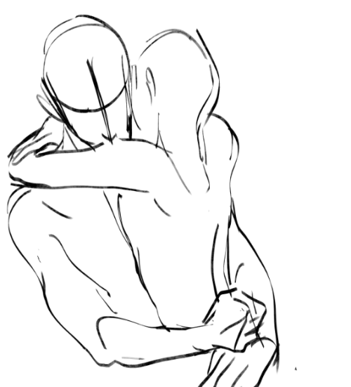
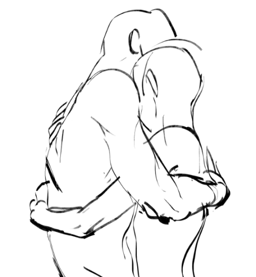
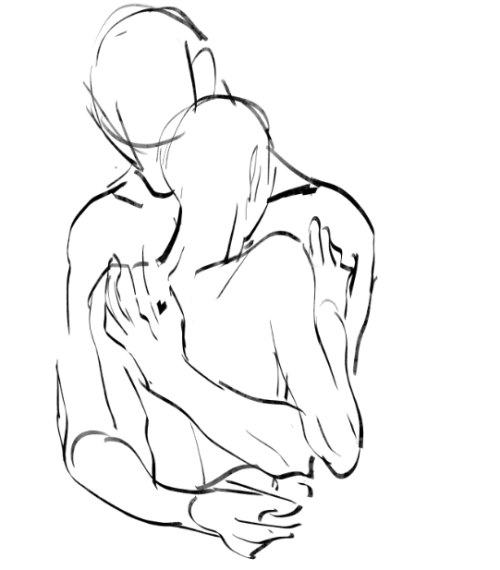
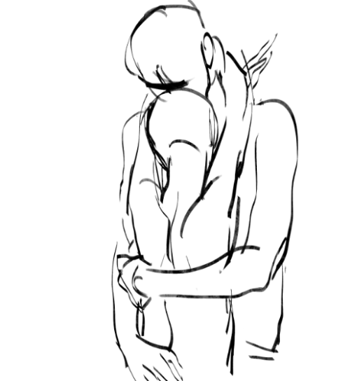
Im In A Really Fluffy Mood Today


im in a really fluffy mood today
More Posts from Artrefforsteph and Others
i dont really need a whole tutorial but i was wondering if you had any coloring tips?
uhm uhm i guess the main thing for me personally is for shading, don’t use a colour that’s just darker than your base colours e.g if you have yellow, don’t use a darker version of that same yellow. use an orange or pink

using a darker version of base colours is boring imo. play around with colours until you find something you like. mix colours together. its fun
i hhope that helped
Hi! I love your art of various fanlands and i was wondering, would you ever do a tutorial on how you draw them or the process of how you draw them? Or perhaps have any tip or tricks?
sure.
there are certain things/tricks I do almost every time, so here we go.
pick colors for the sky and the ground.

Keep reading

The Pale Horseman - Submitted by: fastman27
#FDFBEE #DEDEBA #B5C19C #619058 #3F5943 #27332A #121514

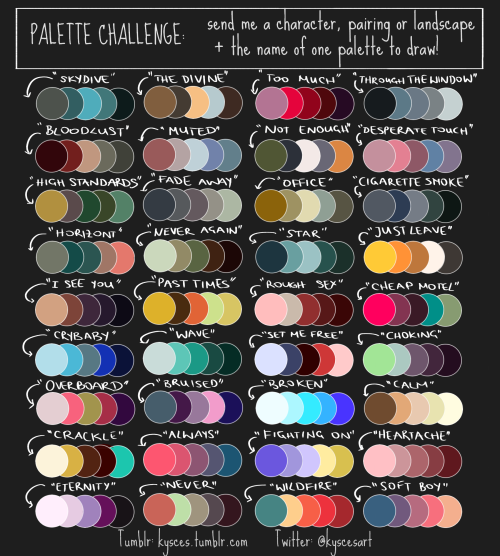
I finally made my own palette challenge! Send me, or the artist who reblogs this, a character, pairing or landscape + the name of one palettte to draw!
create your own home!
i found this great site that lets you create 3d models and floor plans of custom homes! you can even put in furniture and customize wallpapers/floors!! it has everything you could ask for!! you can use it make ref pictures of your oc homes or just make your dream house!
this is what i manged to make


shading colour tips
hey yall its me the Art Mom™ to help you shade pretty
rule 1: DO NOT SHADE WITH BLACK. EVER. IT NEVER LOOKS GOOD.
red- shade with a slightly darker shade of purple
orange- slightly darker and more saturated shade of red
yellow- i think like..a peach could work but make it a really light peach
green- shade with darker and less saturated shade of blue or teal
blue- shade with purple
purple- a shade thats darker than the purple you’re using and maybe a little pink (MAYBE blue)
pink- darker shade of red
white- a really light lavender or blue..or i guess any really light colour??
black- okay listen dont use pure black to colour anything unless you want to leave it with flat colours because you cant really shade black lol
grey- a slightly darker shade of purple or blue (less saturated)
brown- slightly darker and less saturated shade of purple or red
aaaaand thats all i got lol. let me know if there is anything i should add to this list!!
so I downloaded a new art program recently

It’s called Krita. Maybe you’ve heard of it, but in case you haven’t, seriously, check it out! It’s really nice!
The best way I can describe this program is that it’s a combination of Easy Paint Tool SAI and Photoshop. And the best part is the program is completely free to download from their website. I think what I like most about it is that not only does it have a Stablizer like SAI does, but it has practically all the tools I ever use from Photoshop. Not saying it’s going to replace SAI or PS for me (at least not yet; I’m still learning my way around Krita lol), but it’s probably the only thing I’ve ever found that is coming close to doing it.
I put some screenshots under the cut!
Keep reading
The lip sync tutorial they DON’T give you
I mentioned on twitter that I wanted to do a lip sync tutorial and immediately got some people who were interested so I put one together real quick!
I’m going to use a bit of unfinished lip sync from my taz animated part as reference. They’re just gifs so no sound, but you should still be able to tell that he’s saying “I’d say a solid B… Solid B minus.”
Anyone who’s looked up how to do lip sync has seen phoneme charts. Phonemes are just the shape your mouth makes when you make certain sounds.

When you do lip sync, you want some kind of reference to make sure it’s right
What’s easiest is to say it yourself and pay attention to the shapes your mouth is making. Since you’re going frame by frame, your audio is slow enough that you can make each shape slowly and distinctly and you can get each individual phoneme down in the animation.

Don’t do this.^
An easy way to tell if you’re animating lip sync wrong is if you run out of frames to make each shape. You don’t need them! Making each shape is unnatural. People talk quickly and the mouth doesn’t have the time to get into each shape. They blend together, sometimes to the point where the shape doesn’t change at all!

Not only does the 2nd gif take less frames and energy to make, it’s more relaxed, it looks less distracting, and his lips are much easier to read!
These are reference charts to show the differences more clearly


This is the difference between getting swallowed up in every last detail and paying attention to reality.
What matters more than hitting every syllable is making it look natural and flow with the acting. That’s why anime mouth flaps can work so well. A strong pose through the whole body matters more than one mouth shape.
-
 sinfullymalfoy liked this · 1 month ago
 -
 handlesshoe liked this · 5 months ago
 -
 d-strl reblogged this · 5 months ago
 -
 ugli-ly reblogged this · 5 months ago
 -
 srgeanthunter liked this · 8 months ago
 -
 artsylittlebi reblogged this · 8 months ago
 -
artsylittlebi liked this · 8 months ago
-
 khaleesiaveline liked this · 8 months ago
 -
 vicekings liked this · 8 months ago
 -
 buckybitchinbarnes reblogged this · 8 months ago
 -
 orcamaniac liked this · 8 months ago
 -
 twostrangerintheworld liked this · 9 months ago
 -
 sciencewife liked this · 9 months ago
 -
 lakewaterduck liked this · 10 months ago
 -
 nomiyakazehaya reblogged this · 10 months ago
 -
nomiyakazehaya liked this · 10 months ago
-
 sillydragons liked this · 10 months ago
 -
 mikaa4 liked this · 11 months ago
 -
 choay007 liked this · 11 months ago
 -
 shirabara liked this · 1 year ago
 -
 shinjuhakutsuru liked this · 1 year ago
 -
 spaghettiarts liked this · 1 year ago
 -
 bvbvbbvv reblogged this · 1 year ago
 -
 emmiewlw liked this · 1 year ago
 -
 horsejawbone liked this · 1 year ago
 -
 dkaymiscellaneous reblogged this · 1 year ago
 -
 nagakiba liked this · 1 year ago
 -
 fandydandyyy liked this · 1 year ago
 -
 dixory liked this · 1 year ago
 -
 bunbuttbread reblogged this · 1 year ago
 -
 faralyart liked this · 1 year ago
 -
 tsubomi reblogged this · 1 year ago
 -
 ear liked this · 1 year ago
 -
 nylilcosmos liked this · 1 year ago
 -
 joelmillerson liked this · 1 year ago
 -
 agender-riot liked this · 1 year ago
 -
bunbuttbread reblogged this · 1 year ago
-
bunbuttbread liked this · 1 year ago
-
 amitybrightlights liked this · 1 year ago
 -
 pie-a-rino reblogged this · 1 year ago
 -
 toteeyebags liked this · 1 year ago
 -
 lenze459 liked this · 1 year ago
 -
 threading-fate liked this · 1 year ago
 -
 jaibafachas reblogged this · 1 year ago
 -
 maxmrefs reblogged this · 1 year ago
 -
 m-o-v-e-d277227 liked this · 1 year ago
NSFW because there will probably be nude refs | this is a side blog to sort all of the art stuff I need | none of it is mine
151 posts