Belle Concept Art
Belle Concept art


"Belle"- collection of concept art from "The Man Who Leapt Through Film" - part 1
More Posts from Lucidmoth26 and Others
Moonlight and Sunshine
Those are one of my favorite ways of comparing and contrasting characters.
Hello again, I made an earlier comment where I believed that Marinette should be called the “Sunshine of Gotham”. However, there is one nickname that I think suits her as well. She could be “Gotham’s Moonlight”. Sunshine is bright but it can burn. Moonlight on the other hand is calm and cool, and shines brightest during the dark night. It fits Marinette because even when things got dark in HER life, she always finds a way to make everything and everyone feel lighter and hopeful.
I love it! I feel like that would start a Twitter war XD some people for the #sunshineofgotham side and the others on the #gothamsmoonlight or #moonlightofgotham made shirts. Everyone starts to wonder what side the Wayne's are on. Dick, Ivy, Barbra, Stephanie, Superman, Duke, Aquaman, Beastboy, Starfire, and Flash are on team sunshine, Jason, Tim, Selina, Harley, Cassandra, Raven, and Cyborg are on team moonlight. Bruce, Diana, and Alfred? They're on team #princessofgotham.
Damian? #angelofgotham.
And yes they all have shirts. As well as buttons, hats, jackets, and tot bags.
Harley and Ivy wearing their shirts and that's how they find out which side they're on. Harley's crying in a corner like "I don't know who you are anymore!"
I tried the thin line art for a comic I'm doing, I sort of regretted it I probably should have used a thicker brush. But on the flip side I gotten better of using the erase lasso when doing thin lines. Anyway this is probably my favorite art study of @genericpuff's journey in mastering Lore Olympus art style but if you ask me I like where Lore Rekindled is and I love how it's art style looks, you can see Genericpuff's art style mixes in and impacts the story even to it's most tiny details.
I also love how she makes the butterflies and wild flowers glow.


doing more style studies, here's LR persephone with the stylization of pilot era LO , with some of the effects I use in LR (but adjustments made to the lineart style because looking back a lot of the pilot era LO pieces that I loved had really thin lineart, which i've always been really bad at doing sksksksk)
I really love it when They do Art sketches of Lore Rekindle
i absolutely loathe that the only thing truly standing between me and replicating S1/pilot era LO art perfectly is fucking phOTOSHOP

do i have access to photoshop??? yes.
do the kyle webster brushes look 10x better in photoshop than they do in clip studio??? yes.
am i willing to switch from clip studio to photoshop for all my character flatting??? idk if that's a sacrifice i'm willing to make- 😭
Sketch help
fat bodies tutorial!
ALRIGHT SO my pal @kalreyno wanted help with drawing fat characters and as a fat artist i felt like i could give a bit of helpful insight on that. there’s also been a lot of complaining about “boo hoo fat characters are hard to draw so i can’t include them in my work Ever” goin on lately so if that’s your case then this is for you too!! and also just for anyone who would like help with fat bodies in general, ofc. anyway, let’s get this show on the road!!

let’s start with some common misconceptions. these are the two main attempts at chubby bodies i run into, so i’ll focus on them.
the Anime Chubby i see everywhere, and it’s just……so wrong in many ways. first of all, there is almost no additional body fat compared to your average thin character - except for where it’s added in “attractive” places (breasts, hips, thighs). the breasts are way too perky, and don’t have the realistic shape fat would give them (though how to draw accurate breasts is another tutorial all on its own lmao). there is still a thigh gap, which usually only happens in very thin people, and bones are still visible on the surface of the skin, which also rarely happens in fat people.
the Michelin Man is better in some ways, but still not that great. it’s a slightly better attempt, but basically all that’s done there is taking a thin character and blowing them up, while giving no thought to fat distribution. the thigh gap is usually still present, and they look a lot more hard than soft - and fat is very soft and pliable.
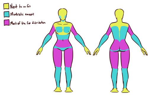
here’s a chart on how fat usually distributes (if you can’t read my messy writing, “1. next to no fat, 2. moderate amount, 3. most of the fat distribution”). basically, the more muscle an area has, the more prone it is to develop fat, such as the abdomen, thighs, and upper arms. it’s important to note that fat sits on top of muscle, and that it does distribute in different levels, and not evenly across the body as shown in the Michelin Man.
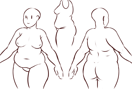
now, here’s an accurate fat body with all of that kept in mind!! notice how the fat isn’t only kept to aesthetically pleasing areas, and how it sits realistically on the character’s body. their breasts sag a lot more, which happens even in thin people with larger breasts, and the nipples are pointing more downwards than straight out. there is no thigh gap in sight, there are no bones in sight, and most importantly, they have fat rolls, which are very important in drawing a convincing fat character!! as far as i know i’ve never met a single person with no rolls at all, and everyone has them, whether thin or fat - they’re just more prominent and more consistently present in fat people. pay close attention to where they are and how they’re shaped.

here are a couple of drawings showing how fat is affected when sitting vs stretching. as seen in the first, the fat specifically on the stomach is distributed a lot more evenly and stretched out, so it becomes “flatter”. the love handles are still pretty visible, though, as well as the fat on the thighs and arms. the breasts are raised with the shoulders, and the fat on the shoulders and near the neck forms rolls as it’s being pushed together.
in the second, there is a lot less room for distribution, so the fat is all pushed together. the breasts sag and the stomach forms rolls and spills into the lap. a good analogy for the way fat works is to liken it to a water balloon, and thinking of how its shape would change when resting flat on a surface, hanging off of a ledge, held upright, etc.

here are a few extra tips i find a lot of people miss!
first on the top is the hip/pubic region. the first circle is showing the way the bellybutton is folded in fat people, as opposed to stretched out in thinner people. the second is the stomach fat spilling over onto the pubic region and creating a separation in the two areas, which is something that’s missing in a lot of art. in addition, the pubic mound also gains fat, making it round as seen in the profile drawing i did up there (i’ve heard people refer to it as fupa?). the last in the hip region is the lack of a thigh gap. i can’t stress this enough!!!! if you’re trying to draw a convincing fat character, make sure their thighs are pretty much always touching!! for reference, mine literally don’t separate until my feet are about 2ft from each other.
the bottom right is showing the double chin, which a lot of people are afraid to draw!! fat does distribute itself here too, and there’s nothing wrong with it, so don’t feel like you shouldn’t give fat characters a double chin in your work for fear of it looking like a caricature.
in the bottom middle, it’s showing how fat affects different types of breasts with the presence of more or less breast tissue.
lastly, at the very right are stretch marks with their usual locations and directions, which i also can’t stress enough!!!!! i sometimes forget to add them honestly, but they’re so important in accurately portraying fat characters, as they literally come from the skin being stretched from fat being gained (and they’re also just rlly neat lookin like why wouldn’t you lmao). some people have less and some people have more, feel free to experiment with them!

the last thing is body types!! there isn’t one single way for a person to be fat, so feel free to experiment with shapes once you’ve learned the basics!!
so there you have it, a tutorial on how to draw chubs!! now go forth and make some accurate fanart or some rad fat characters, because the world could always use more of both. hmu if you have any questions or concerns, and thanks for reading!!
EDIT: someone pointed out the bad wording in the tutorial. thank you for bringing it to my attention and sorry for offending anybody. i’ve updated the tut, so please reblog this one!
I may be used to him as a ghost, But to know that in one world he's living happily in life. Makes me happy.

Elias but him living in Modern day~
🩵🌹✨
Before I got into this AU I thought it was funny more or less, I can't wait to read more though 😁


... I couldn't resist doing more self-insert stuff whoops
Belle Concept art four


"Belle" concept art by Almu Redondo and Cartoon Saloon
Taken from their artstation
I will now be Taking Commissions
$5.00 for sketching
$10.00 for color
$15.00 for backgrounds
$20.00: for Color/ sketching
$25.00 for a comic of your favorite characters
😊

[Image Description: A Tweet that reads: Hey, you. You're valid for writing fanfiction. Someone has stayed up late reading your words on their phone with auto-rotate off. Someone has dropped everything when they got that update email. Your work has made someone happy and you do it *in your spare time*. You're awesome. End ID.]
I really like this Au, as a ballet lover sometimes


*Throws out a few crumbs of Nutcracker AU art* (づ๑•ᴗ•๑)づ♡
I figured that since it’s now the festive season, I’d do a bit of Nutcracker AU art haha! Also I decided to change up a few of the designs for the characters in this AU cause I wasn’t too happy with them 😅
-
 spideyladman liked this · 2 weeks ago
 -
 light21knight liked this · 2 weeks ago
 -
 lover-lagoon liked this · 1 month ago
 -
 maddix-hallow liked this · 1 month ago
 -
 starrysailor liked this · 2 months ago
 -
 rohilvu liked this · 2 months ago
 -
 siliconeentity reblogged this · 3 months ago
 -
 morgannevoyles liked this · 4 months ago
 -
 thyholybread reblogged this · 5 months ago
 -
thyholybread liked this · 5 months ago
-
 tsukicosplay liked this · 6 months ago
 -
 lightvictoriadelgado liked this · 7 months ago
 -
 uswhovianswillholdasiton liked this · 7 months ago
 -
 ann-draws-art reblogged this · 8 months ago
 -
ann-draws-art liked this · 8 months ago
-
 nube-de-angel liked this · 8 months ago
 -
 haveyouseenmyhonor reblogged this · 9 months ago
 -
haveyouseenmyhonor liked this · 9 months ago
-
 red0-3 liked this · 9 months ago
 -
 skaillar liked this · 9 months ago
 -
 lucidmoth26 reblogged this · 9 months ago
 -
lucidmoth26 liked this · 9 months ago
-
 hikothealien liked this · 10 months ago
 -
 bitchingcowboy liked this · 10 months ago
 -
 kkloco liked this · 10 months ago
 -
 meatflavoredjelly reblogged this · 11 months ago
 -
 senkis-things liked this · 11 months ago
 -
 sad-neil liked this · 11 months ago
 -
 beecollage83 reblogged this · 1 year ago
 -
 welpjesuisla liked this · 1 year ago
 -
 zebsfloppyears liked this · 1 year ago
 -
 bambeptin liked this · 1 year ago
 -
 milfbrainrot reblogged this · 1 year ago
 -
 aimlessartist17 reblogged this · 1 year ago
 -
 hornyyandere liked this · 1 year ago
 -
 oc4everything liked this · 1 year ago
 -
uwu838 liked this · 1 year ago
-
 safelyinsideabook liked this · 1 year ago
 -
 duskneko reblogged this · 1 year ago
 -
 karpaasikarpalo liked this · 1 year ago
 -
 tsukimineve23876 liked this · 1 year ago
 -
 diamondsheep reblogged this · 1 year ago
 -
diamondsheep liked this · 1 year ago
-
 cutiepancake reblogged this · 1 year ago
 -
 kurama-maria liked this · 1 year ago
 -
 msfortunekat liked this · 1 year ago
 -
 if-you-are-tired-clap-your-hands reblogged this · 1 year ago
 -
 dragonfriend-named-croizzant liked this · 1 year ago
 -
 dungeonmussy liked this · 1 year ago

Hi, I like many things from RPGs ,music, anime, drawing, and horror games
82 posts