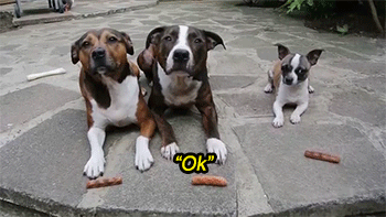
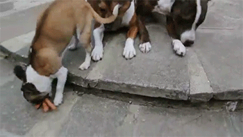
This Is Scarier Than Any David Lynch Film
this is scarier than any david lynch film
More Posts from Like-luke-likes and Others

Theory: Frank Miller's recent work is good, but DC have no idea what to do with it


Above: I recoloured that recent Wonder Woman cover Frank Miller did for DC last week. Mine on the left, DC’s on the right. I did this to demonstrate a theory I have that despite the general critical consensus, there’s actually nothing wrong with Frank Miller’s recent art- it’s just that DC don’t know how to treat it.
In January of this year I tried out to be a colourist for Frank Miller at DC. Not because being a colourist for the comics has always been my dream, or because I’m the world’s biggest Frank Miller fan, but because I kept seeing some pretty awesome drawings of his being critically savaged. He’s a good artist, but people were talking as if these recent drawings were the scrawlings of a lunatic. I felt like I needed to step in.
Below is one of the Miller covers I recoloured for DC. My colours on the top, and DC’s original on the bottom. Here you can see the discrepancy between the potential I saw in these drawings, and what was actually being published.

I spoke to a couple of editors at DC and the consensus seemed to be that they loved what he was turning in. So why did every blog I read think it was the worst work he’d ever done? I believed that the colour treatment DC was giving to his art was in no way flattering to the type of work he was doing.
My friend Julian Dassai said it best: “His work is dynamic and, in some cases, verging on abstract. Trying to color his stuff with representational lighting and rendering is pointless, whereas a flat, graphic approach (or just leaving it in b&w) allows the energy to jump off the page.” My colour job, followed by what DC actually published:

Frank is an artist who is constantly evolving, and his new work seems to be somewhere between Jim Mahfood, Sergio Aragonez and Ralph Steadman. It doesn’t make sense to colour him as if he’s an Image comics artist from the 90’s, all gradients, shadows and shiny metallic finish.
Here’s another one. Again: my work on the top, DC’s on the bottom.

All these images I’ve posted so far have two things in common- they were all widely dunked on and derided when they first went online, and they all prompted responses of “WHOA, COOL!” and “I LOVE THIS!” after I recoloured them and circulated them amongst my friends. So what happened here is ol’ Frank became the butt of everyone’s joke when actually, there was nothing wrong with his drawings.
So how did this happen?
Well, check out Frank’s work in the Sin City comics. When Frank works in black and white, he’s a one-man band. But when he works in colour, he hangs back and gives the colourist a lot of space. He knows that colours and inks are two halves of a whole.

Above is a page from 1986’s The Dark Knight Returns. You can see just how much trust Frank placed in his colourist, Lynn Varley, to finish his work. As you can see, some of those panels aren’t even THERE in the original inks. Panel 6 is just an empty box.
This approach has been proven to work very well, but the problem is it places the burden of the image’s success or failure squarely on the colourist’s shoulders. And if the colourist and Frank aren’t on the same page, we end up with terrible covers that are the laughing stock of the whole internet.
It’s funny- even Lynn Varley could screw up colouring for Frank. Two years after their critically acclaimed work 300, they made their most widely panned book of all.

Lynn’s computer colouring on Dark Knight Strikes Again has all the invention and nuance of her colouring on Frank’s earlier work. However, her experimental digital art just isn’t a good fit for Frank’s traditional, brusque inkwork. The artwork in the book suffered a generally poor reception from fans and critics alike.
I took a pass at colouring DK2, too. I include this not to throw shade on Lynn’s work, or to say that I’m a better colourist (I’m not), but just to support my claim that there’s nothing wrong with Frank’s pencils and inks in even the book that was generally regarded to be his worst. His lines have character and energy and do everything they need to do to tell the story, and with the right treatment would have looked pretty great.


We can apply the same lessons to Frank’s most recent work. I’d read a whole comic that looked like either of the recoloured images below.


DC liked my stuff, but they’re happy with the guy they already have colouring Frank’s work, and so my experiment has to run its course. Still, I want to believe that there’s something in here that we can all learn from.
It’s important to pick the right team, and to utilise a stylistic approach that’s harmonious with what the rest of the group are doing. If you don’t, you might just end up with something terrible even though you worked your butt off. As we’ve seen, it can even happen to an exceptional talent like Frank. That’s a scary thought.


I wish actors did like. Actor concerts or something
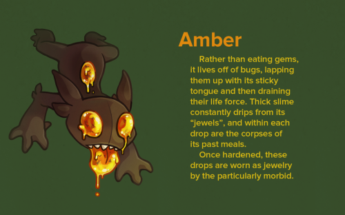
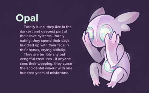
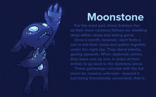
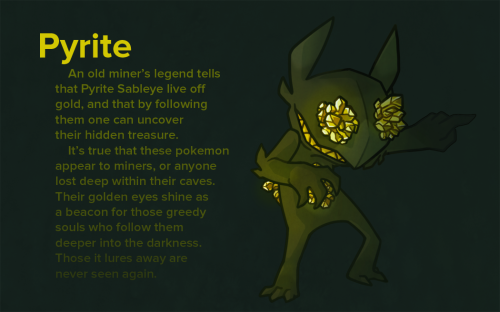
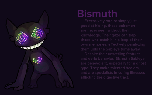
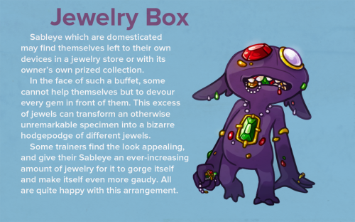
Wanted to try my hand at those pokemon variations things I see going around! I’ve had gems on the brain, so why not use Sableye, right?
Dale Earnhardt, Jr. Tweeted in support of the NFL protesters and added that JFK quote, “Those who make peaceful revolution impossible will make violent revolution inevitable.” Which. Is unfathomably woke for NASCAR
an unstoppable force (my overwhelming need to be loved) vs an immovable object (my refusal to speak with anyone)
me: i hate country music
shania twain: let’s go girls!
me:


-
 mijucats reblogged this · 1 week ago
 -
 notexactlyanartblog reblogged this · 1 month ago
 -
 positive-vids-to-make-me-not-die reblogged this · 1 month ago
 -
 maple-sno-cones liked this · 1 month ago
 -
 agent-five reblogged this · 1 month ago
 -
 harrese reblogged this · 1 month ago
 -
harrese liked this · 1 month ago
-
 luuru-rublog liked this · 1 month ago
 -
 mushroommargo reblogged this · 1 month ago
 -
 itsthekiks reblogged this · 1 month ago
 -
 skee3000 liked this · 1 month ago
 -
 neon-shaddows reblogged this · 2 months ago
 -
 birdy-reblog reblogged this · 2 months ago
 -
birdy-reblog liked this · 2 months ago
-
 au1umo liked this · 2 months ago
 -
 mossnrocksnmarshwater reblogged this · 2 months ago
 -
 mothmanfucker2 reblogged this · 2 months ago
 -
mothmanfucker2 liked this · 2 months ago
-
 ilaughtatmyself liked this · 2 months ago
 -
 lackluster-rat liked this · 2 months ago
 -
 local-transan reblogged this · 2 months ago
 -
 kitty-chan444 reblogged this · 2 months ago
 -
kitty-chan444 liked this · 2 months ago
-
 threecirclesofvaryingsizes reblogged this · 2 months ago
 -
 annieisyourfavourite liked this · 2 months ago
 -
 lunar-lumi liked this · 2 months ago
 -
 princessragdoll liked this · 2 months ago
 -
 doomguybi liked this · 2 months ago
 -
 furbls liked this · 2 months ago
 -
 zoradementio liked this · 2 months ago
 -
 overtimeatthechopshop liked this · 2 months ago
 -
 bee-boppin liked this · 2 months ago
 -
 fvlltimefae liked this · 2 months ago
 -
 intrepidescapist reblogged this · 2 months ago
 -
intrepidescapist liked this · 2 months ago
-
 icarusfrommars liked this · 2 months ago
 -
 chicka-dee-dee reblogged this · 2 months ago
 -
 cowpokezuko liked this · 2 months ago
 -
 asthma-goddess reblogged this · 2 months ago
 -
 thedragoninthetardis reblogged this · 2 months ago
 -
 jellicle-chants reblogged this · 2 months ago
 -
 zapm reblogged this · 2 months ago
 -
 insectapologist reblogged this · 2 months ago
 -
 0vergrownruins liked this · 2 months ago
 -
 wherethevoidends reblogged this · 2 months ago
 -
 xiiidarkside reblogged this · 2 months ago
 -
 namethatghostling reblogged this · 2 months ago
 -
 bongjoonheaux liked this · 2 months ago
 -
 welpnotagain reblogged this · 2 months ago
 -
 sailor-marinara22 reblogged this · 2 months ago

Stuff I like that I reblog, and stuff that I post .... Luke
5K posts