So, Let Me Guess– You Just Started A New Book, Right? And You’re Stumped. You Have No Idea How Much
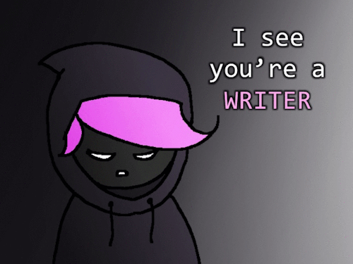

So, let me guess– you just started a new book, right? And you’re stumped. You have no idea how much an AK47 goes for nowadays. I get ya, cousin. Tough world we live in. A writer’s gotta know, but them NSA hounds are after ya 24/7. I know, cousin, I know. If there was only a way to find out all of this rather edgy information without getting yourself in trouble…
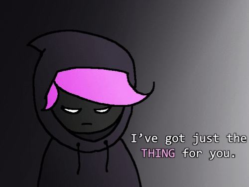
You’re in luck, cousin. I have just the thing for ya.
It’s called Havocscope. It’s got information and prices for all sorts of edgy information. Ever wondered how much cocaine costs by the gram, or how much a kidney sells for, or (worst of all) how much it costs to hire an assassin?
I got your back, cousin. Just head over to Havocscope.
((PS: In case you’re wondering, Havocscope is a database full of information regarding the criminal underworld. The information you will find there has been taken from newspapers and police reports. It’s perfectly legal, no need to worry about the NSA hounds, cousin ;p))
Want more writerly content? Follow maxkirin.tumblr.com!
More Posts from Basket-of-references and Others
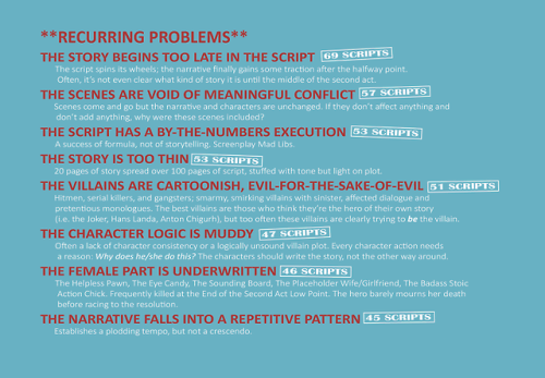
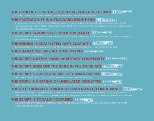
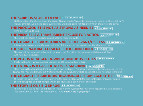
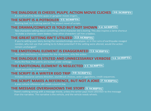
12 Red Herrings to Keep Your Readers Distracted
I’ve seen mystery/thriller authors use the same handful of red herrings too many times to count. So here are some (hopefully not as common) red herrings for your writing.
1. The Unreliable Narrator's Bias
Your narrator can play favourites and scheme and twist the way your readers interpret the story. Use this to your advantage! A character portrayed as untrustworthy can really be someone innocent the narrator framed, vice versa.
2. The Loyal Traitor
A character with a history of betrayal or questionable loyalty is an obvious suspect. They did it once, they could do it again, right? Wrong! They’ve actually changed and the real traitor is someone you trusted.
3. The Conflicted Expert
An expert—like a detective, scientist, or historian—analyses a piece of evidence. They’re ultimately wrong, either due to bias, missing data, or pressure to provide quick answers.
4. The Overly Competent Ally
You know that one sidekick or ally who’s somehow always ahead of the curve? They’re just really knowledgeable, your characters know this, but it makes it hard to trust them. Perfection is suspicious! But in this case, they’re actually just perfect.
5. The Misleading Emotional Clue
Maybe one of your characters is seen crying, angry, or suspiciously happy after xyz event. Characters suspect them, but turns out they’re just having a personal issue. (People have lives outside of yours MC smh). Or it could be a cover-up.
6. A Misleading Alibi
At first this character’s alibi seems perfect but once the protag digs into it, it has a major hole/lie. Maybe they were in a different location or the person they claimed to be with was out of town.
7. The Odd Pattern
Have a seemingly significant pattern—symbols left at crime scenes, items stolen in a specific order, crimes on specific dates. Then make it deliberately planted to mislead.
8. The Misinterpreted Relationship
A character was secretly close to a victim/suspect, making them a suspect. Turns out they were hiding a completely unrelated secret; an affair, hidden family connection, etc.
9. A Forgotten Grudge
Create a grudge or past feud and use it to cast suspicion on an innocent character. Introducing an aspect of their past also helps flesh out their character and dynamics as a group + plant distrust.
10. The Faked Death
Luke Castellan, need I say more (I will)? A supposedly innocent character dies, but turns out they faked it and were never a victim in the first place. They just needed to be out of the picture.
11. The Mistaken Eavesdropper
A character overhears a threat, argument, etc. They suspect B based on this convo, but turns out they just came to a false conclusion. (Or did they?)
12. The Forgetful Alibi
Someone confesses to hearing/seeing a clue, but turns out they were mistaken. Maybe they thought they heard a certain ringtone, or saw xyz which C always wears, but their memory was faulty or influenced by stress.
Looking For More Writing Tips And Tricks?
Check out the rest of Quillology with Haya; a blog dedicated to writing and publishing tips for authors!
Instagram Tiktok
Digital Painting: tips for beginners
Heyo! I got asked if I could make a tutorial on digital painting so I’m gonna throw together some advice meant for people who are starting out and want to figure out exactly how this stuff all works. Because it’s hard! What I hope to accomplish here is to make painting more approachable for you.
Firstly, I have put together something like this before, so for archival purposes here it is: http://holy-quinity.tumblr.com/post/89594801811/i-dont-know-how-much-of-this-kind-of-thing-you
For those of you who don’t wanna bother reading that, here are the main points:
1. Learn your program and its tools, from brush properties to layer styles. And I mean learn them. Make a cheatsheet that shows you exactly what each button and scale does, both in isolation and in conjunction with other buttons and scales. Refer to this as much as possible until it is intuitive. The end goal is to know exactly what to do to your brush’s settings to achieve a given effect.
2. It’s perfectly okay to use your sketches, linearts, and other forms of line in your paintings. They can help guide the form and there’s no need to make something fully “lineless”! I never make things “lineless.”
3. Study other people’s art and try to think how they could have possibly achieved the effects they did. You can learn a lot just by observing and mentally recreating the process stroke by stroke—muscle memory is a powerful tool at your disposal. This becomes easier to do once you’ve started doing item 1 above.
OKAY!
So where the heck do you even begin?
What I’m gonna do is try to make digital painting as approachable as possible for someone who’s never really done it. The main idea here is that digital painting is just like real painting. So if you’ve ever done real painting, you already kinda know what’s coming.
I’m gonna assume you know the basics of digital art: you can sketch, line those sketches using layers and opacity changes, and fill the lines with color, maybe even opting to add some shading…and you’ll get something like this:

You know, cell-shaded, or maybe the shading’s blended, but you’ve still obviously a line drawing with color put down on layers beneath the lines.
The next intuitive step is to try going “lineless”…but when you remove the lines you get this:

idk about you but I’m laughing at how stupid this looks
When I was first teaching myself to paint digitally, I didn’t really know how to deal with this. Without lines, the form of the subject vanished or became a mess like the above. Even if I was meticulous and careful about placing down the color such that without the lines layer turned on, the shapes fit together, it didn’t look quite right. There’d be gaps, I wouldn’t know how to incorporate the subject into a background, the contrast wouldn’t be high enough, or it’d just in general look too much like a screenshot from Super Mario 64.
Painting requires a different process than the above. You’ll have to let go of some of your habits and conventions. Such as staying in the lines. Such as fully relying on the lines. Like, I love my lines, I love my sketches—but in painting, they are guides for form, and are not the form itself. So let me go through how I approach a given painting:

My painting process starts with a sketch (here a boring portrait for demonstrative purposes). I make the opacity of the sketch layer something like 30%, and then throw down my base colors on a new layer underneath. I’m not being meticulous about the sketch itself, because again it’s just meant to guide my placement of color. I’m also not meticulous about my placement of the color.
We’re essentially sketching with color. Because ultimately what we want is for the color to take on the form and shapes conveyed by the sketch.
There’s a lot going into this about how to use value, how to shade, how to use color, etc. that I’m kinda skipping over because it takes a lot of time to explain…but there are hundreds of tutorials out there on those topics so please, google around! I found some helpful tuts that way when I was starting out.
Something I find v useful is to keep selecting colors that already exist in your image for shading and hue adjustment. This is why I start with really blendy, low-opacity brushes when throwing down color on top of the background. I can then select colors within there that are a mix of the two.
For instance, I’ll select the color of the lines here:

…and use that to shade:

And maybe I’ll select one of the darker shades around his eye, but not the darkest, to make the shading a smoother gradient…and so on.
What I do in general at this point is go over the shapes and lines of the sketch. Such that I can turn off the sketch layer and see this:

I’m replacing the lines with shading and value. I’ll continue to do this as I keep adding color.

This is all super loose. I am not dedicated to any particular stroke. I just want the colors and shading and light source to be right. I’ll use overlay layers to boost contrast or add a hue.
Here are other examples where I used this process:


I am constantly changing brushes and brush settings as I paint. It really depends on what effect I want where. I am also constantly selecting new colors and applying or blending those in. I don’t believe in having some uniformly applied base color and then shading with only one or two…that’s what I’d do if I was cell-shading like the first drawing I showed you here, but painting should be about messing with color and opacity and blending to make millions of hues!
Good rule of thumb: Hard, opaque brushes for applying color. Soft, dilute brushes for blending colors. Sometimes hard, dilute brushes can make some cool blending effects! I personally prefer harder edges on my shading so that’s a brush I use often.
This is getting a bit long so I’m gonna split it up into multiple parts, but really what I want you to get from this is:
1. learn the tools at your disposal until they are intuitive
2. sketch and line are guides for form, not the form itself
3. rather, hue and value will produce the form
And of course, practice makes perfect!!! Every drawing you make, every painting you make, will bring you one step closer to the artist you want to be, and thus every drawing and every painting, no matter what, is a success.
if ur ever feeling bad about your art just remember your twelve year old self would think it was soooo cool


Here's my "lazy" foliage tutorial! 🍀 (I say "lazy" in quotes as I consider this method a shortcut, but still requires some effort for the drawing to look nice)
Gif version of the process:

Thanks for reading!
Main art blog/ Consider tipping me on Ko-fi if you've found this useful!
being a self-taught artist with no formal training is having done art seriously since you were a young teenager and only finding out that you’re supposed to do warm up sketches every time you’re about to work on serious art when you’re fuckin twenty-five


Just a reminder about fatphotoref.com—it exists!! I'll be updating with new photos next week and hopefully more regularly after that. Request access by going to bit.ly/fpraccess 💙🧜♀️ happy mer may!
Hello! I hope you dont mind me asking, but how do you draw those amazing black and white comics? (Coffee and The Goddess comics come to mind!) I love the way you do them and would love to know the process you go thru!
this is a pretty broad question and im guessing/hoping you meant “how do you color in black and white in your comics” so have a few random tips about values and paneling and stuff i guess


thank you


-
 lemyondre reblogged this · 1 week ago
 -
lemyondre liked this · 1 week ago
-
 aqua-luxe reblogged this · 1 week ago
 -
 beautifulfestivaleagle liked this · 1 week ago
 -
 samantha-kirkland-reblogs-art reblogged this · 1 week ago
 -
 deimosbreakfrost liked this · 1 week ago
 -
 fritzistoodrunktobeattheworkshop reblogged this · 1 week ago
 -
fritzistoodrunktobeattheworkshop liked this · 1 week ago
-
 keep-going-to-the-sunrise liked this · 1 week ago
 -
 aphrodykev liked this · 1 week ago
 -
 witchcraft8775 reblogged this · 1 week ago
 -
witchcraft8775 liked this · 1 week ago
-
 johns-eldritch-eyes reblogged this · 1 week ago
 -
 grey-eyed-gemini liked this · 1 week ago
 -
 smutteeth liked this · 1 week ago
 -
 thevikingfish-nimhrodell reblogged this · 1 week ago
 -
 dogtoolbox reblogged this · 1 week ago
 -
 mutsukiss liked this · 1 week ago
 -
 magic-and-moonlit-wings reblogged this · 1 week ago
 -
 brazilianturbofolk liked this · 1 week ago
 -
 c4rn4ge444 liked this · 1 week ago
 -
 shadedswarriorsworld reblogged this · 1 week ago
 -
 magekingmorgan liked this · 1 week ago
 -
 memmie04 liked this · 1 week ago
 -
 faithfullyfalse liked this · 1 week ago
 -
 whatinthehellisgoingonrn reblogged this · 1 week ago
 -
 madgoat212 reblogged this · 1 week ago
 -
 0pure-insanity0 reblogged this · 1 week ago
 -
 sexualrevoluti0n reblogged this · 1 week ago
 -
sexualrevoluti0n liked this · 1 week ago
-
 thelesbianoracle reblogged this · 1 week ago
 -
thelesbianoracle liked this · 1 week ago
-
 connectionterminated13 liked this · 1 week ago
 -
 atroposy liked this · 1 week ago
 -
 dawngabriel reblogged this · 1 week ago
 -
 gottamakethiswork liked this · 1 week ago
 -
 vorvayne reblogged this · 1 week ago
 -
vorvayne liked this · 1 week ago
-
 genderisaliesowhyshouldihaveone liked this · 1 week ago
 -
 inlovewithbeidou liked this · 1 week ago
 -
 im-estiah liked this · 1 week ago
 -
 shyinsunlight liked this · 1 week ago
 -
 gemini-rosa liked this · 1 week ago
 -
 monjustmonsideblog reblogged this · 1 week ago
 -
 naughty-nought liked this · 1 week ago
 -
 the-quackalyspe liked this · 1 week ago
 -
 burning-up-ao3 reblogged this · 1 week ago
 -
burning-up-ao3 liked this · 1 week ago
-
 columboposting reblogged this · 1 week ago
 -
columboposting liked this · 1 week ago
