Color Saturation Guide By AlaiGanuza


Color Saturation guide by AlaiGanuza
More Posts from Basket-of-references and Others
![[ Download Link ]](https://64.media.tumblr.com/5f429d178bb1fe4870a8c6931415c38e/1c195b3b919b6bc0-22/s500x750/9f3e89788ae15eab900a39fc63f99bd7a543868d.jpg)
![[ Download Link ]](https://64.media.tumblr.com/6dd33d9a47c84fae4004c3891a069032/1c195b3b919b6bc0-70/s500x750/7a350518ca98cd34cd6e5fa9cd463fb933dbcf11.jpg)
![[ Download Link ]](https://64.media.tumblr.com/c6bcee52d8e78ba0e31e786b91f81fc1/1c195b3b919b6bc0-03/s500x750/735d52cfd62421cf43e46a8a710f76dad2c52707.jpg)
![[ Download Link ]](https://64.media.tumblr.com/87c3f0ff1da8e8a917485898808bd63b/1c195b3b919b6bc0-64/s500x750/62e90c66492ac189a3325bbd25965dd635cc65b7.jpg)
![[ Download Link ]](https://64.media.tumblr.com/133564050990bca016611a68fa71a2de/1c195b3b919b6bc0-c1/s500x750/87ea85696f416c49b91f8f64754306f4208b6726.jpg)
![[ Download Link ]](https://64.media.tumblr.com/9a2582c5d3abc3f5cf6ce4587482f493/1c195b3b919b6bc0-c5/s500x750/19c8f03ee111f028acd365ae95b24a04a72e60d9.png)
[ Download Link ]
As promised, it’s finally here! Thank you to all of my patrons for not only the support that made this possible, but for giving me the confidence to work on a big project like this.
Rather than providing any drawing instruction, what this writeup aims to do is help you learn to unpack the decisions being made in a given composition, and articulate what elements in a piece are responsible for its impact. Being able to isolate these qualities in your own art and art that inspires you opens up avenues for improvement regardless of medium, style, or technical skill. This is the first of hopefully many PWYW art ‘tutorials’ from me.
I hope you all enjoy!


I have made a pay-what-you-want zine about... How To Make Zines!
I go over my entire process, so you too can learn how to supplement your income with zines. Please give it a look, and share if you find it helpful!


Art Help

I redid this list because broken links 💀
General Tips
Stretch your fingers and hands
Art is for fun
Never too late to start/improve
Using a tablet
Editing software: pictures & video
Moodboard resources
Comic pacing
Watercolor
Coloring
Color Theory (not children's hospital)
Resources: coloring things a different color
Gold
Dark Skin undertones
Dark Skin in pastel art
POC Blush tones
Eyes colors
Human Anatomy
POSE REFERENCES
Wizard Battle poses
Shoulders
Tips for practicing anatomy
Proportional Limbs
Skeletons
Hair Directions
Afro, 4C hair
Clothing
Long skirts
Traditional Chinese Hanfu (clothing reference)
CLOTHING REFERENCE
Sewing information
Animals
Horse -> Dragon
Snouts: dogs, cats, wolves, fox
Foot, paw, hoof
More
Drawing references sources
Art tutorial Masterlist
Another art tutorial Masterlist
Inspiration: father recreates son's art
Inspiration: Lights
ART BOOKS
Plants/flowers: North America, Hawaii, Patagonia
U use colors in such a enrichening way, how do you do that may I ask??
thank you so much! 💕
this answer is going to be a little long.
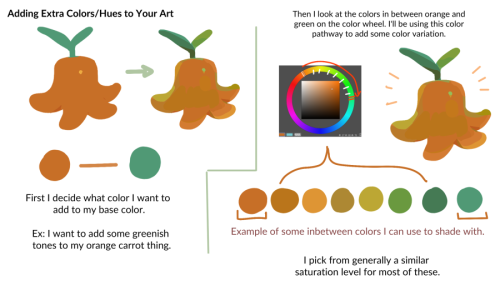
the first thing, i think, is that it's very common to think of color as a means to an end, as just another type of information about a drawing: i'm using brown on the hair to show that the hair is brown, i'm using green to show that the characters are standing in grass.
but if color is information, then we can use it to say a lot more than just the basic facts of a drawing!
if you love drawing but want to get better with color, you have to learn to love color, too.
to want to know everything about how color works, to explore what different colors mean to you, to try and try and try again.
because, and this is the kicker:
ALL COLORS ARE RELATED TO EACH OTHER!

[from this post about how to use a color wheel]
i think it's common for people to talk about complementary colors and that's helpful when you're starting out with coloring, but i feel that it can become very limiting when it's treated like a rule and can obscure the fact that all colors are related to each other. it's called a color wheel because there is no beginning or end!

for example, take this drawing:

in this drawing, i'm using colors from all over:

but by just rearranging them slightly and throwing them against a black background like in the drawing, you can see how they're actually relating to each other and not nearly as random as they may seem at first glance!

[these notes are from this post where i break down how muted or "ugly" colors pull an image together] all colors are related to each other in some way, and that means that
YOU MUST DETERMINE WHAT EACH COLOR MEANS TO YOU, AND IT IS YOUR RESPONSIBILITY TO CONVEY THAT MEANING TO YOUR AUDIENCE.


for example, to me green can be uncomfortable and overwhelming, energetic and edgy, calm and natural, or fearful and tense. but no matter how it makes me feel, it's my responsibility to convey my relationship to green to whoever even glances at my drawing.
sure you can use commonly held ideas about colors [red = angry, blue = sad], but this shorthand is also limiting. if everyone used these commonly held ideas about color, there would be no room for experimentation or interesting, wild color choices! and colors mean different things to everyone-- that's what makes everyone's colorful art so different and so cool!!
another thing to note about those green drawings: each one is using a specific type of green.
the one with reigen leans blue-green, which creates a cool-colored image. meanwhile, reigen is warmer tones, which almost makes it seem like he's overheating when he's thrown against such a cool-toned background, which further expresses his discomfort!
the dimple!mob drawing is like a sprite or mountain dew-green, which encourages the feeling of electricity or energy. it's a cool yellowish-green.
the one of mob floating is a warmer yellowish-green, to suggest sunny warmth without drawing sun rays.
the divine tree arc drawing is a lot of reddish-greens, which can suggest a sickliness.
experiment with color combinations and different shades and hues! explore what these different types of colors mean to you!
so now let's get into the nitty gritty of color choice. the following images are from my free pdf about color, composition, and intuitive drawing:


the main takeaways from these pages are:
consider simplifying your colors! more colors does not necessarily equal a better drawing.
see how much a single color can do! can you use it in multiple places on your drawing? what meaning can you ascribe to the colors you're using?
consider creating a concept for your colors and a few rules to guide your piece! a lot of great drawings can fall apart because the coloring concept was too vague or because there weren't enough rules or guidelines to keep the image coherent.
are your colors saturated enough? are the different colors you're using fighting for the viewer's attention? do you have focal points in your art, and if so, are the colors you're using reinforcing those focal points?
use the tools at your disposal! color-picking, color balance, overlay layers. it can feel important to try to prove something by hand-picking every color, but even when i hand-pick my colors i almost always check them with color balance anyway to make sure i'm picking the best colors possible.
YOU DO NOT HAVE TO SUFFER FOR ART. PLEASE use everything that is available to you, and make sure that you are aligned with what brings you joy when you're making art!
i wanted to show an example of a drawing i've done that is doing way too much vs a drawing that is simpler but more balanced:


on the left, the colors are interesting but the background is too strong and is competing with the actual drawing for attention. on the right, the clear background and simple coloring create a cute, easy to read, successful image! this is what i mean when i say that colors can fight for the viewer's attention and mess up a good drawing.
my final secret is that i rarely shade with or use white, black, or grays. i don't think this is a rule that you have to follow, but i like it because it pushes me to figure out what colors will go best with each other, and i think this single tip has strengthened my understanding of color immensely. however, there are a lot of beautiful art styles that shade with and use pure white, black, and gray. you have to decide what you love!
and
STUDY!!!
look at other people's art, color pick it, and make a palette based on their art! look at how they represent values through color, how they shade, etc. study your favorite artists' work!! you will learn so much!!
i hope this was helpful! if you have any more follow-up questions or if there's something that you want to know that i didn't explain here, please don't hesitate to ask!

art cheats
hello i am here today to not lose track of the art cheats i have discovered over the years. what i call art cheat is actually a cool filter/coloring style/way to shade/etc. that singlehandedly makes art like 20 times better
80’s anime style
glitch effect
glow effects
adding colors to grayscale paintings
foreshortening ( coil )
foreshortening ( perspective )
clipping group (lines)
clipping group (colors)
dramatic lighting ( GOOD )
shading metal
lighting faces
that is all for today, do stay tuned as i am always hunting for cool shit like this
Okay guys, here's the best drawing advice I can possibly give to someone struggling to find their "style" or is just a beginner in general. Now when I say this you'll probably think it sounds overly simple and stupid as shit, but please trust me on this.
Take your paper, take your pencil, a vague idea of what you want to draw, and just go fucking ham. Do not sit there forever slowly sketching and erasing every 30 seconds. Do not waste time second-guessing yourself. Draw something, and if you think it looks like shit, draw it again, slightly differently. Again, I repeat, don't take your time with this. Just go for it and don't stop. Now, that second drawing might still look like shit, but I bet you it's slightly better. Keep doing this. Whatever you liked about the last drawing, stick with it. Separate the aspects you like from the aspects you don't.
Now, every artist learns differently, but for me and many others, this simple trick works wonders, 'cause guess what guys, focusing too much on your little mistakes is what's holding you back. So stop it. I'll reword it one last time just to make sure you get it through your head. When you're just starting out, trying to find your groove,
don't 👏 overanalyze 👏 your 👏 mistakes! 👏

So you might be saying: Lion why a guide on drawing black people? Well young blood it’s because a lot of people cant…seem…to draw…black people..Amazing I know.

Racist (caricatures) portrayals of black people have been around forever, and to this day people can’t seem to draw black people like they are human. If your artwork resembles any of the above even remotely your artwork is racist and offensive. If you try to excuse that as a stylistic choice you’re not only a terrible artist, but racist too!!! Congrats.

Whitewashing is also a problem. A lot of people refuse to draw black features on canonly black characters. While this example isn’t colored, lightening the skin-tone of a character is also considered whitewashing. So lets start with features!

Now all black people have different noses thats a no-brainer, but black noses tend to have flatter bridges, and wider nostrils. Please stay from triangular anime noses and small button noses. Your drawings should not depict black people with abnormally large noses. (Especially if you do not draw other characters this way)

If you feel like the way you draw lips on black characters is offensive or resembles a caricature,it probably does and you should change it. ABSOLUTELY AVOID PLACING LIPS AT THE BOTTOM OF THE FACE.

Hair is so diverse! Please get used to drawing braids, locs,kinks and coils! If you can learn to draw ringlets and long waves you can learn how to draw black hairstyles.

Add clips! Learn how to draw baby-hairs and never be afraid to add color Pinterest and Google are free my dudes! Also try using square brushes for blocking in coils.
OK THAT’S ALL YOU GUYS


-
 sillyspeedwagon liked this · 1 week ago
 -
 3lzwth liked this · 1 week ago
 -
 randomshtickidk liked this · 2 weeks ago
 -
 puer-natus-ab-astris liked this · 2 weeks ago
 -
 starbbyy liked this · 2 weeks ago
 -
 mabs-stuff1 liked this · 2 weeks ago
 -
 sidewalksofthesky reblogged this · 2 weeks ago
 -
 soggy-cerealz liked this · 2 weeks ago
 -
 lifeisfulloflies liked this · 3 weeks ago
 -
 juunana-sai liked this · 3 weeks ago
 -
 nagirart liked this · 3 weeks ago
 -
 lilbarbar666 liked this · 3 weeks ago
 -
 aeloheart reblogged this · 3 weeks ago
 -
aeloheart liked this · 3 weeks ago
-
 readamancy liked this · 4 weeks ago
 -
 marie4345 liked this · 4 weeks ago
 -
 mortallytransparenthideout liked this · 4 weeks ago
 -
 bluebrryangel liked this · 4 weeks ago
 -
art-refdump reblogged this · 4 weeks ago
-
 eagerblackholebaby liked this · 4 weeks ago
 -
 themischiefoftad liked this · 4 weeks ago
 -
 tone-deaf-bard liked this · 4 weeks ago
 -
tone-deaf-bard reblogged this · 4 weeks ago
-
 chexala liked this · 4 weeks ago
 -
 mallymun reblogged this · 4 weeks ago
 -
 lourainwoods-in-the-woods reblogged this · 4 weeks ago
 -
 kata-chthonia reblogged this · 4 weeks ago
 -
 therkalexander liked this · 4 weeks ago
 -
 not-ur-average-anything reblogged this · 4 weeks ago
 -
 orangexmachina liked this · 4 weeks ago
 -
 riskpig reblogged this · 4 weeks ago
 -
riskpig liked this · 4 weeks ago
-
 ladyofthecreeddraws reblogged this · 4 weeks ago
 -
 half-hound liked this · 4 weeks ago
 -
 when-november-ends liked this · 1 month ago
 -
 othershitineedforstuff reblogged this · 1 month ago
 -
 silly-time-clock liked this · 1 month ago
 -
spicyartereferences reblogged this · 1 month ago
-
 void-fawn liked this · 1 month ago
 -
 rabid-catboy reblogged this · 1 month ago
 -
 thegaydragon reblogged this · 1 month ago
 -
 justcrafting reblogged this · 1 month ago
 -
 nevaehjwilliamsvaeh liked this · 1 month ago
 -
 justarandommultifandomgirl reblogged this · 1 month ago
 -
justarandommultifandomgirl liked this · 1 month ago
-
 deathtoyouandtoyours liked this · 1 month ago
